CLIENT
QuickBridge / Small Business LendingELEMENTS
Brand, Print, Logo, Website, DigitalCHALLENGE
How can we change alternative lending forever?
QuickBridge designs loans that fit small businesses better. Its award-winning proprietary lending platform makes sure applications are easier, approvals are faster and service is better. Their mission is to change alternative lending forever by making funding smarter for our customers with the highest standards of transparency and performance and by providing a rewarding culture for their employees. We were tasked with designing a completely new logo, brand identity and website that reflected their vision.

TARGET AUDIENCE: SMALL BUSINESSES
APPROACH
Bridging the gap.
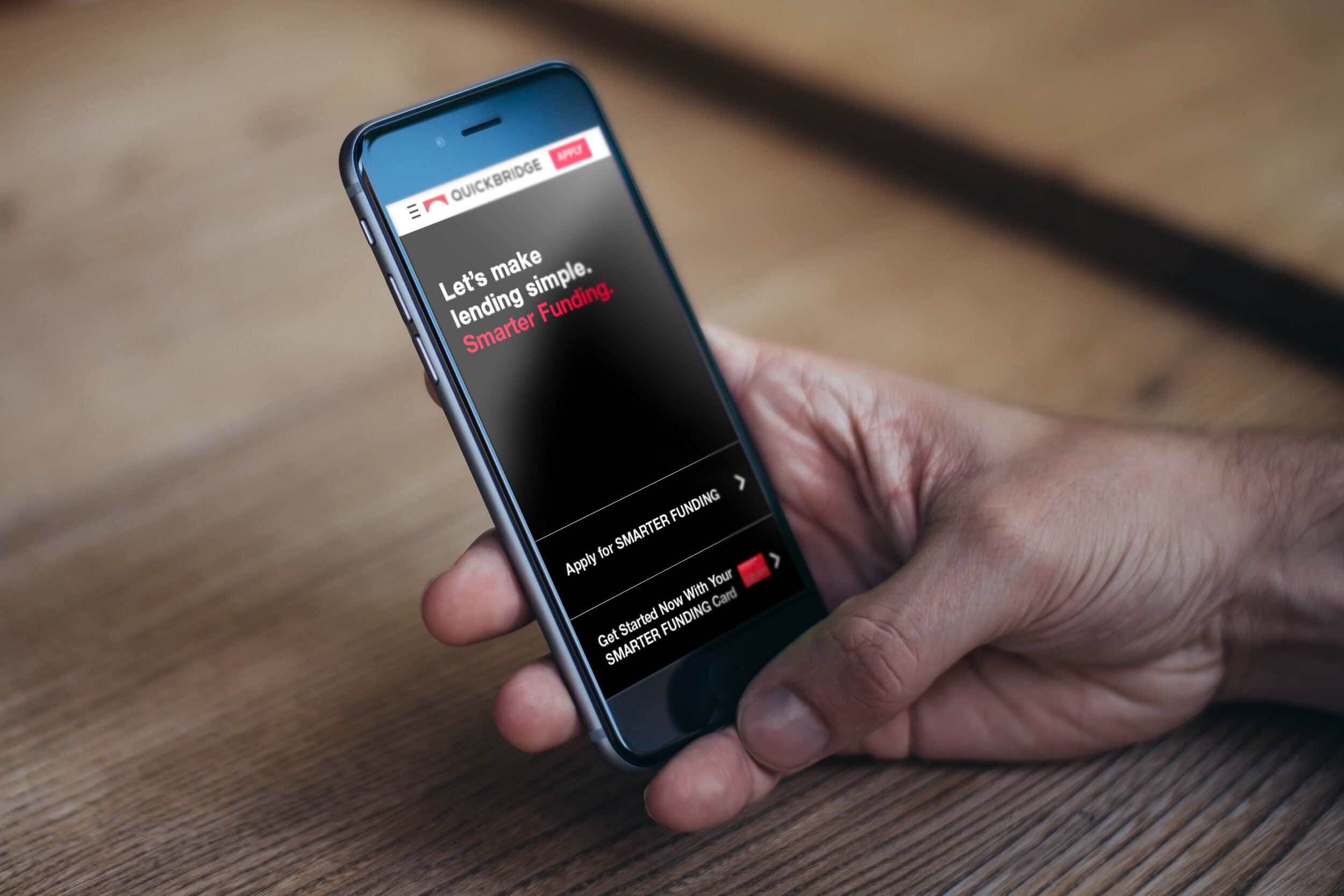
We coined the tagline "Making funding smarter," which provides consumers with an indication of our promise in just a few memorable words. We then designed a complete brand system that clearly communicates the QuickBridge vision and messaging.The logo represents the bridge between QuickBridge and their customers, and their customers and their dreams. It's a symbol of stability and connection.
The bright colors and iconography emphasize energy and movement. They communicate in a bold way in direct contrast to the competition's more sedate approach. These vivid elements are paired with neutral backgrounds, which represent balance and professionalism.

LOGO

WEBSITE


ONE-SHEET


BRAND GUIDELINES
RESULT
We helped make QuickBridge a brand synonymous with smart, reliable small business lending.
You may also like
Featured

